Wellington
Investment excellence from every angle

Investment excellence from every angle
Having established ‘Quality’ as its campaign territory across Hong Kong and Singapore in 2025, Wellington Management faced a different kind of challenge for 2026: how to deepen that positioning without repeating it.
The 2026 Q3 campaign needed to do more than maintain visibility. Wellington was still building brand recognition in the wealth segment; a market where it has historically operated in the shadow of its institutional reputation.
Private banking clients, HNW investors, and wealth advisors across two markets needed to understand not just that Wellington stands for quality, but what that quality looks like across four distinct funds. With a brand-level ad and three product-level ads to unify, the campaign also had to work as a coherent visual suite, not just a collection of executions.

We returned to an idea established in earlier campaigns – the prism as a visual metaphor – and evolved it into something more architecturally ambitious. The creative territory this time centred on the concept of multi-faceted perspective: the idea that in uncertain markets, no single viewpoint is enough.
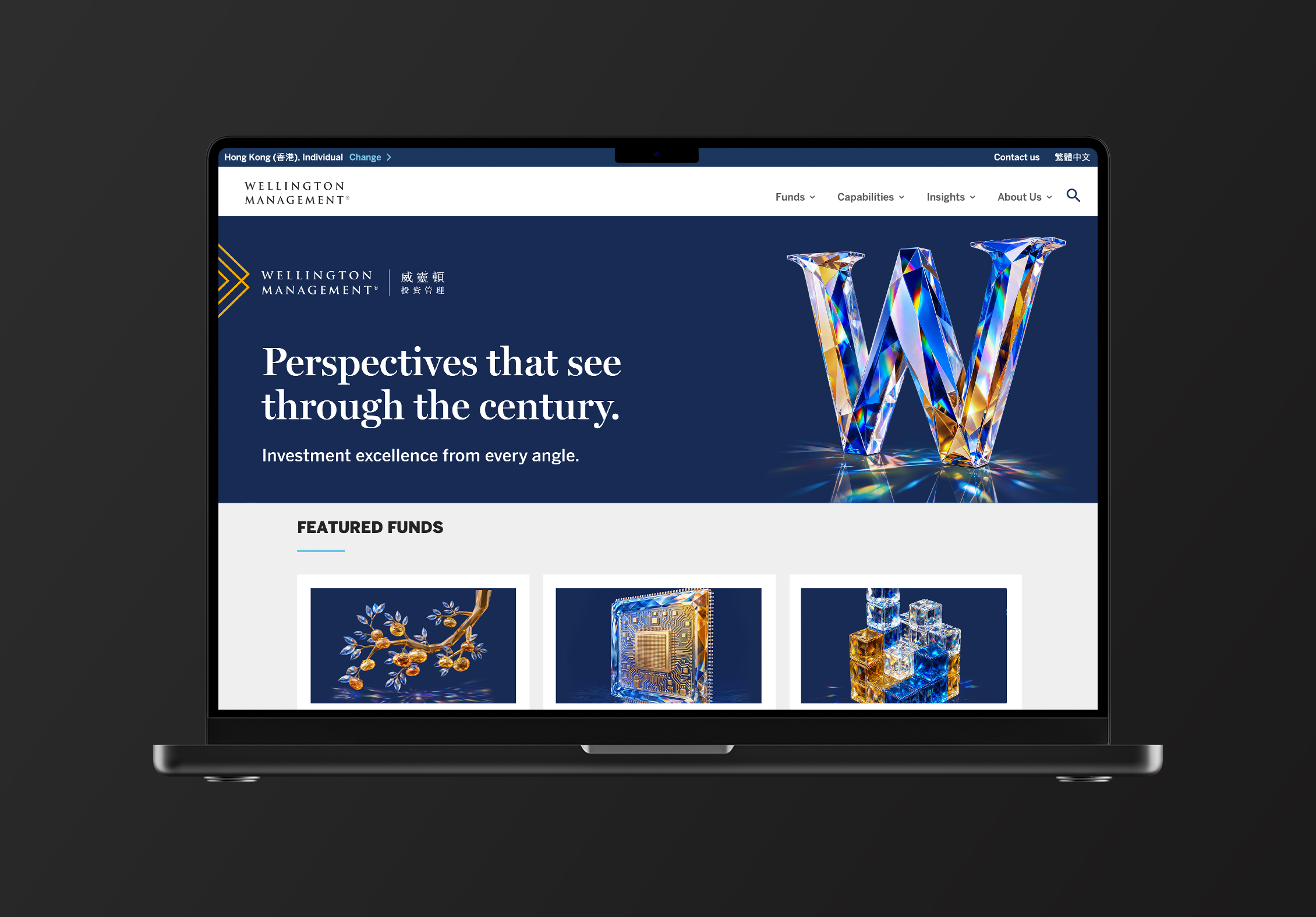
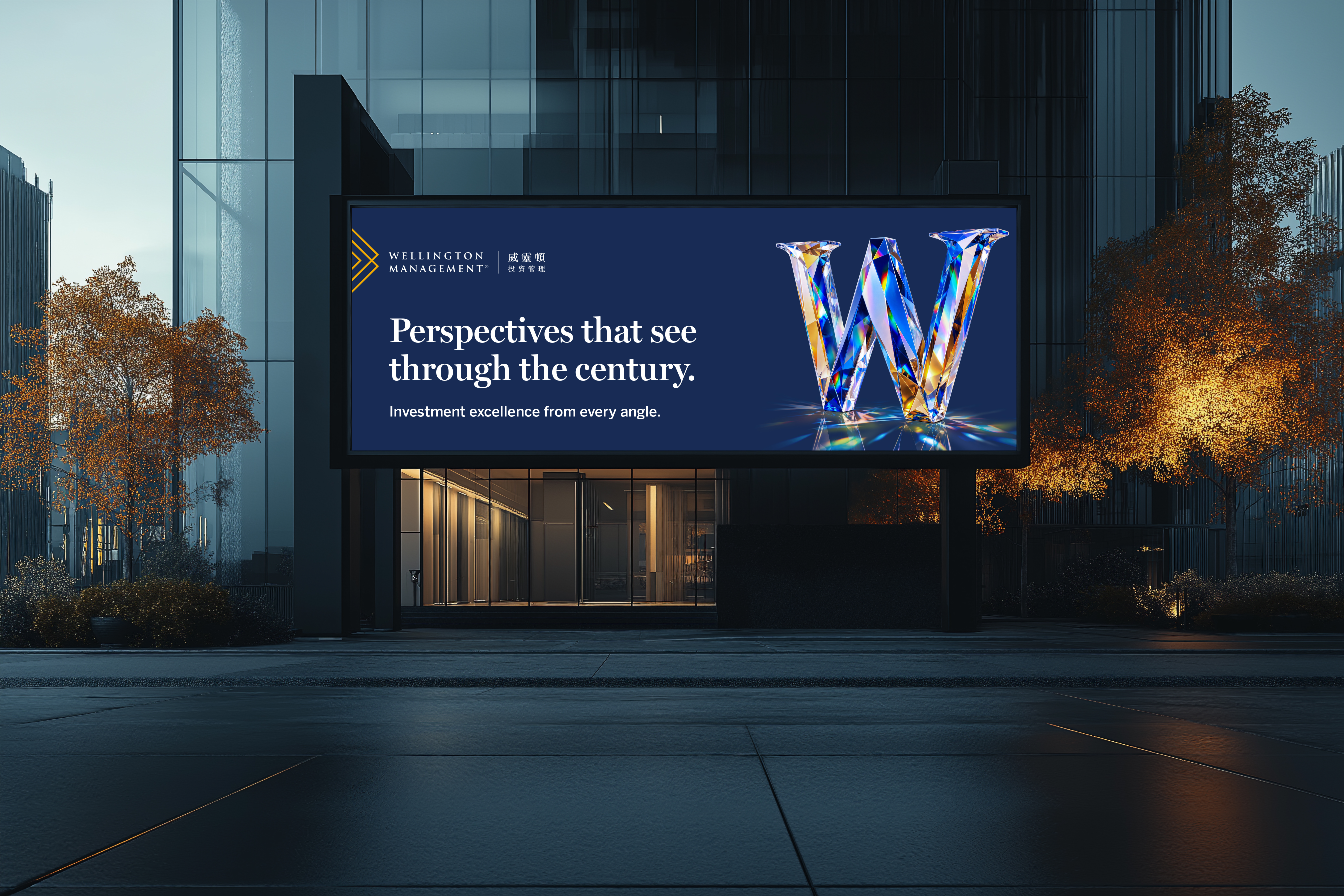
A crystalline ‘W’, Wellington’s logo letter, reimagined as a prismatic sculpture, became the centrepiece of the brand-level key visual. Refracting light in every direction, it expressed Wellington’s cross-asset expertise and nearly a century of institutional depth without a word of explanation. A version with the Boston skyline reflected in the crystal offered an alternative for placements with space for heritage messaging.
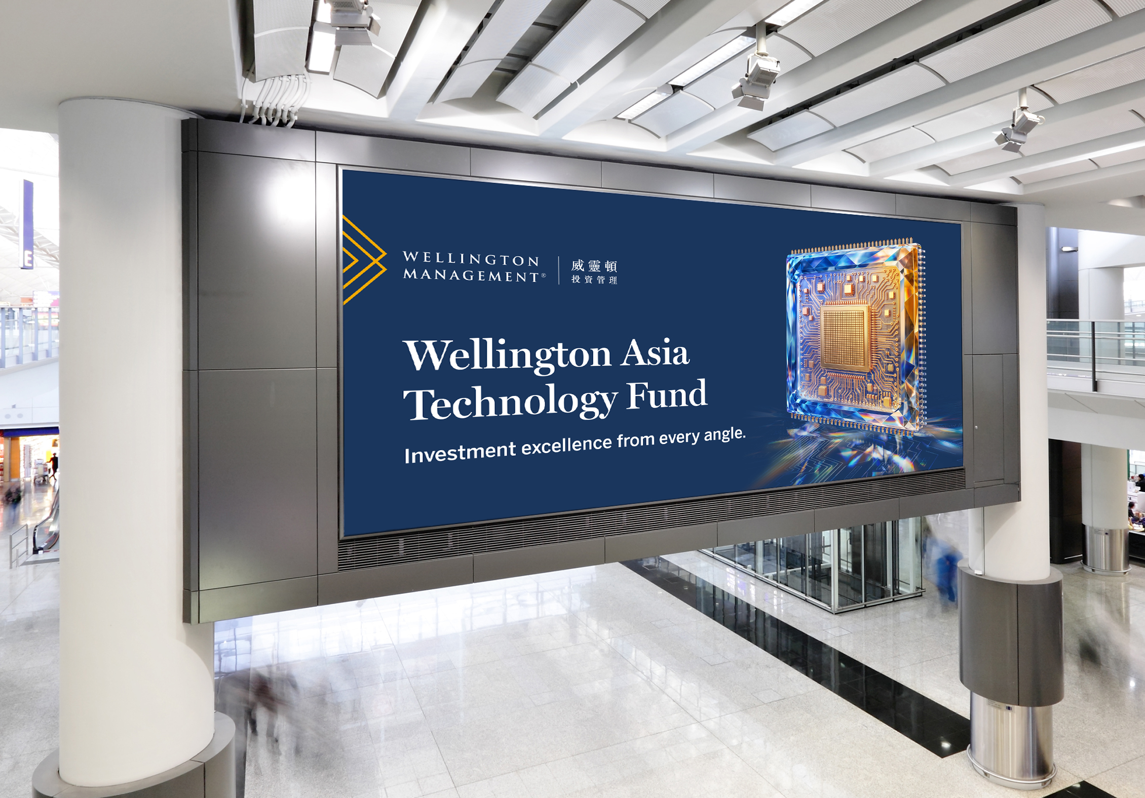
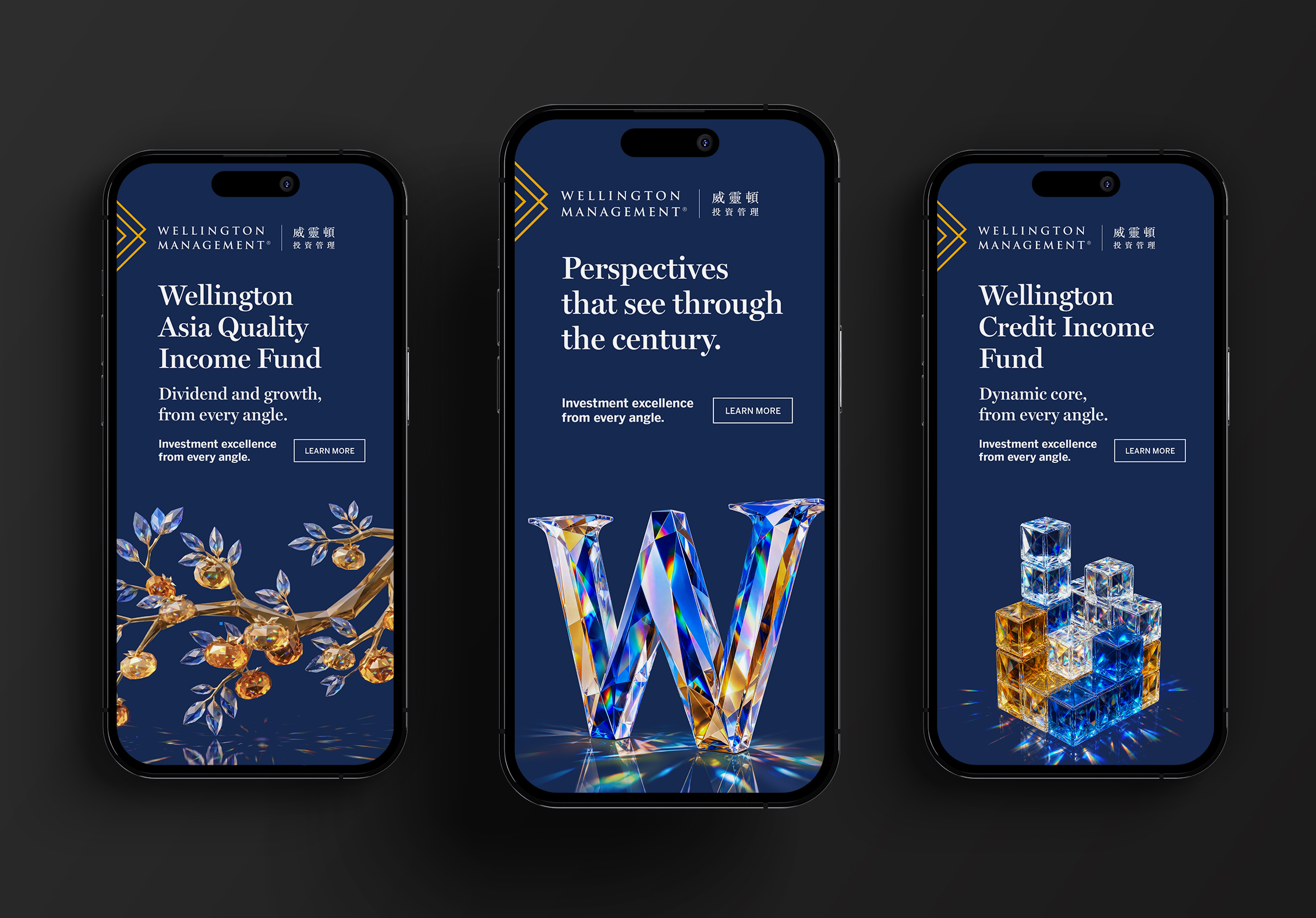
The campaign sign-off, ‘Investment excellence from every angle’, connected brand and product levels with a single, flexible line. At the fund level, it adapted cleanly: ‘Dividend and growth, from every angle’ for the Wellington Asia Quality Income Fund; ‘Tomorrow’s tech, from every angle’ for the Wellington Asia Technology Fund; ‘Dynamic core, from every angle’ for the Wellington Credit Income Fund.
Each fund also received its own crystalline illustration – a jewelled Asian branch, a faceted computer chip, prismatic building blocks – ensuring the visual language cascaded consistently across the suite without becoming repetitive.
The 2026 campaign marks a natural evolution in Wellington’s journey to own quality as a brand differentiator in Asia. Where the 2025 work introduced the proposition with confidence, this chapter adds depth and dimension – proving that a strong creative platform can grow rather than simply repeat.
The crystal W and ‘every angle’ framework give Wellington a scalable visual system that works across billboard, digital, and print, and that can carry multiple funds without losing coherence. It’s a campaign that builds on what came before while giving the wealth segment fresh reasons to pay attention.