Brand refresh, brand, website design
Cripps
Bringing out the purpose and personality of a UK law firm

Challenge
With a history dating back to 1852, Cripps is today the largest independent law firm in the south east of the United Kingdom.
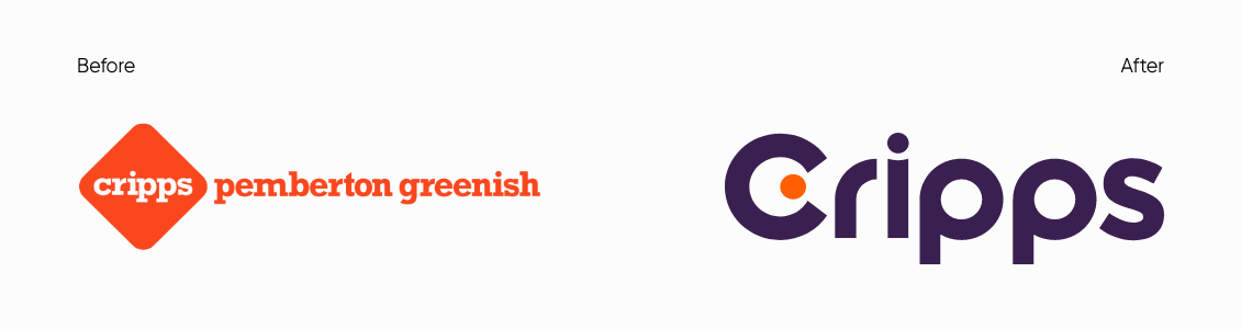
Following the merger between Cripps and Pemberton Greenish in 2018, the firm became known as Cripps Pemberton Greenish but planned to return to the original Cripps name once the full integration of the two firms had completed. What they hadn’t anticipated was how much the world and their business would change between 2018 and 2022. It was clear that in reverting to their shorter name, they also needed to refresh their brand and visual identity to reflect the firm as a unified, purpose-driven business.
Their challenge would be: how to connect to “people” through a singular, cohesive message, seeing as their clientele span from large institutions to family businesses and ultra-high net worth individuals. With this mix of “corporate and private,” it was evident that, in pursuing a new refreshed brand, they would need one that was bold and clear, with resonance and relevance for their varied target audiences. And how would this new brand manifest? A newly designed website would create the right client experience to underscore a new Cripps purpose-led brand strategy.
Solution
Our team dived headlong into this challenge by uncovering the brand truths of the firm. We conducted a series of interviews and discovery workshops to identify and then articulate the many ways Cripps delivered purposeful value for its clients. Informed by the insights of both internal and external stakeholders and directed by the business ambitions of Cripps’ leadership, we developed a brand strategy that encompassed both verbal messaging and visual identity.
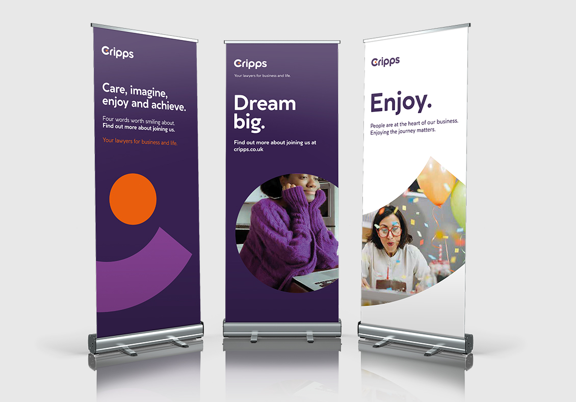
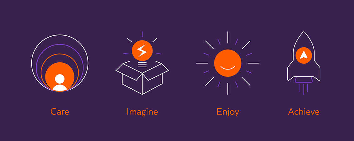
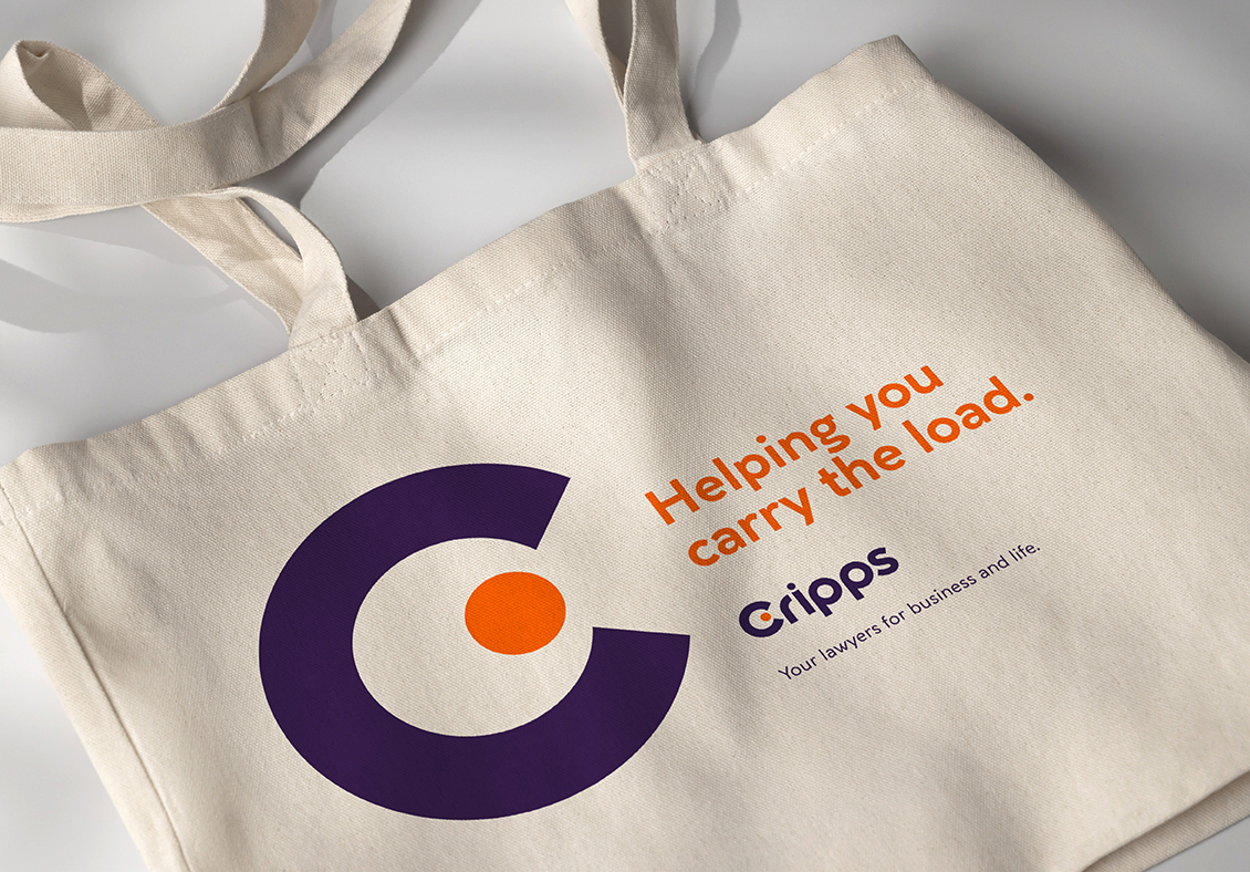
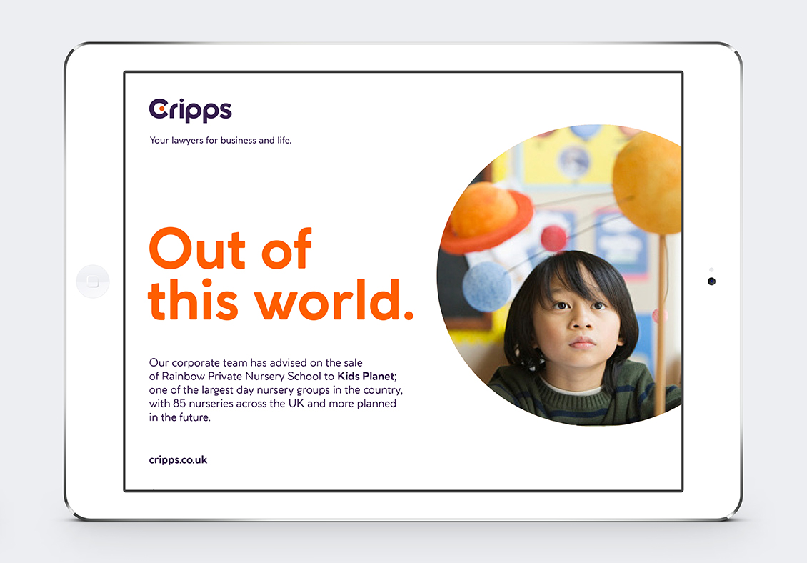
Our messaging deliverables were inspired by Cripps’ “pillars of purpose” and included an overarching vision statement, tone of voice, keywords, and brand characteristics. To communicate the firm’s value while addressing the “corporate and private” challenge, we crafted an elevator pitch along with the strapline: “Your lawyers for business and life.” To ensure relevance to each of Cripps’ practices, we provided custom versions of the value proposition and elevator pitch by audience segment.
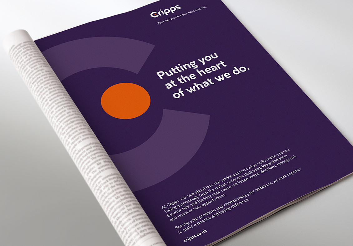
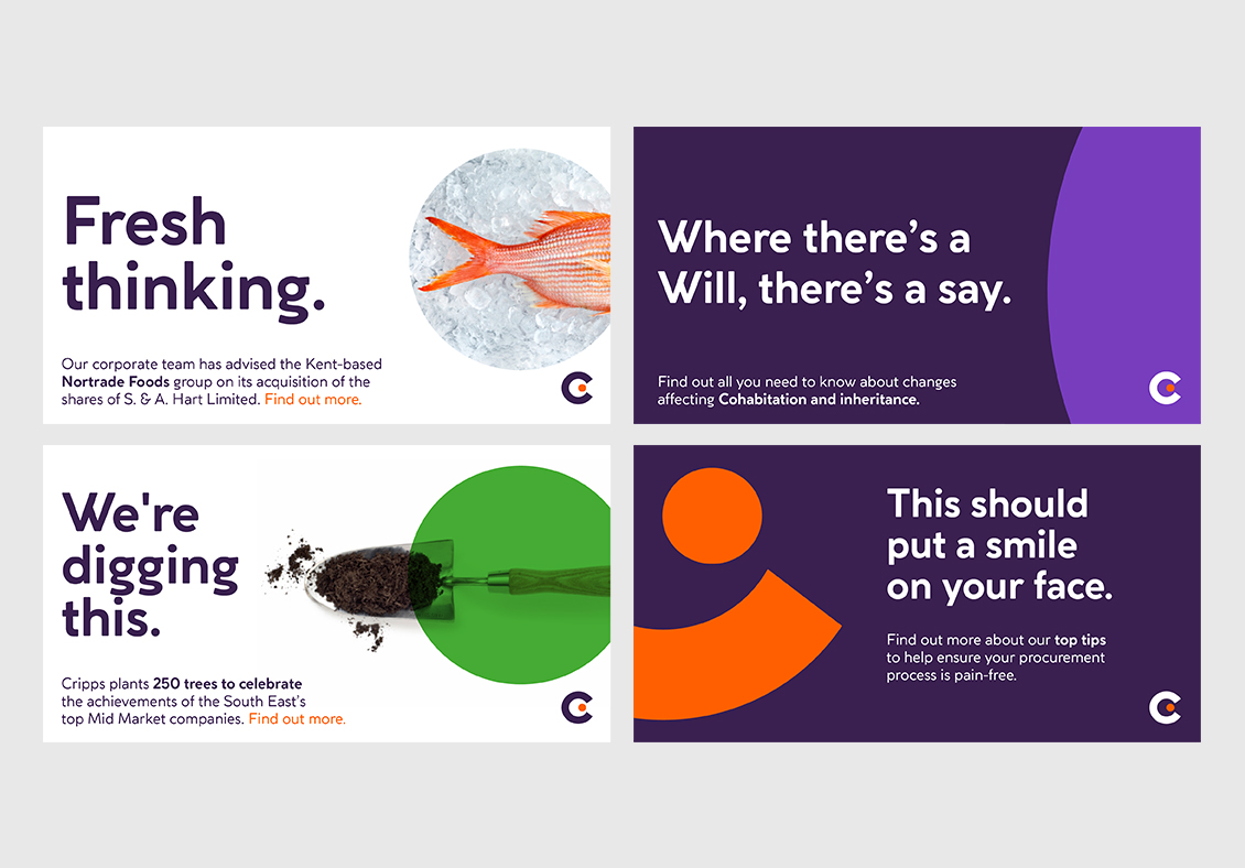
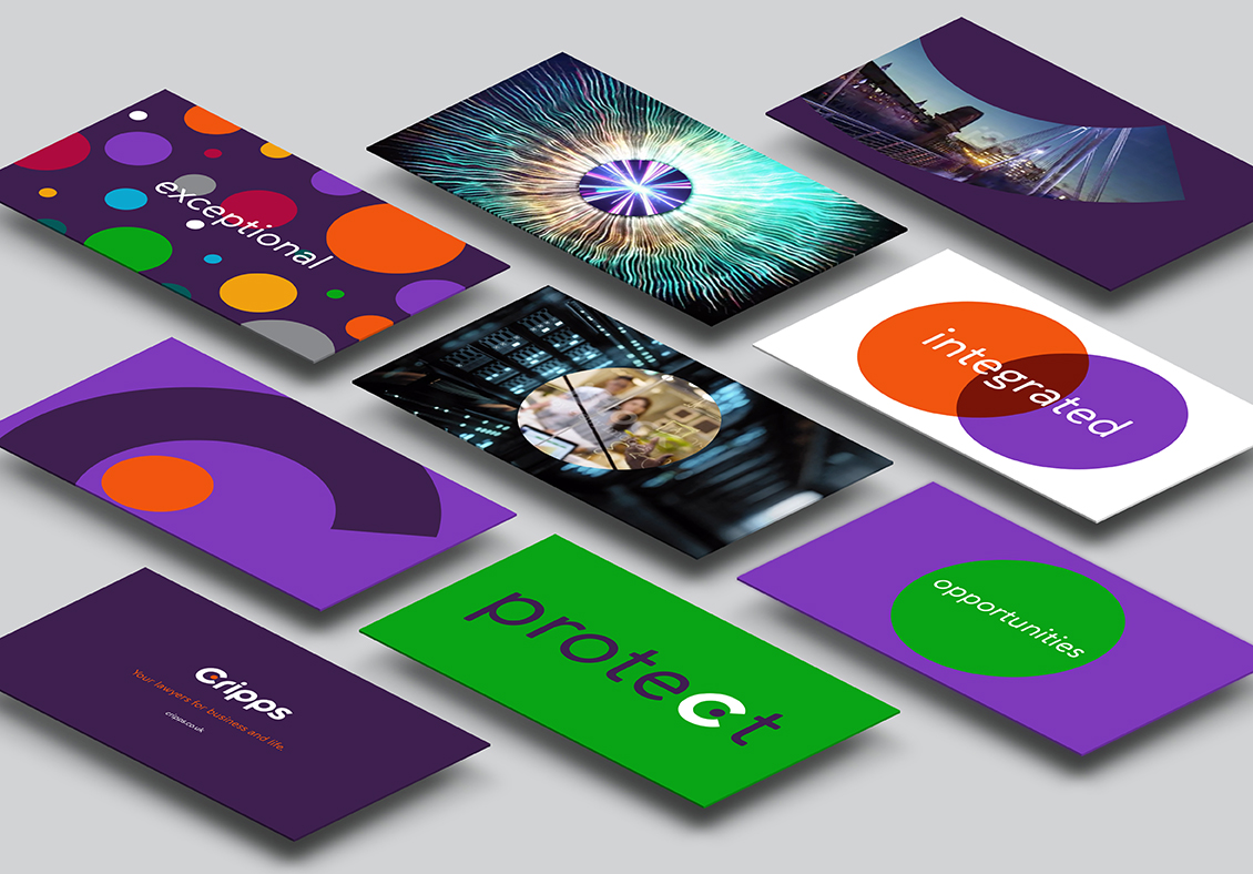
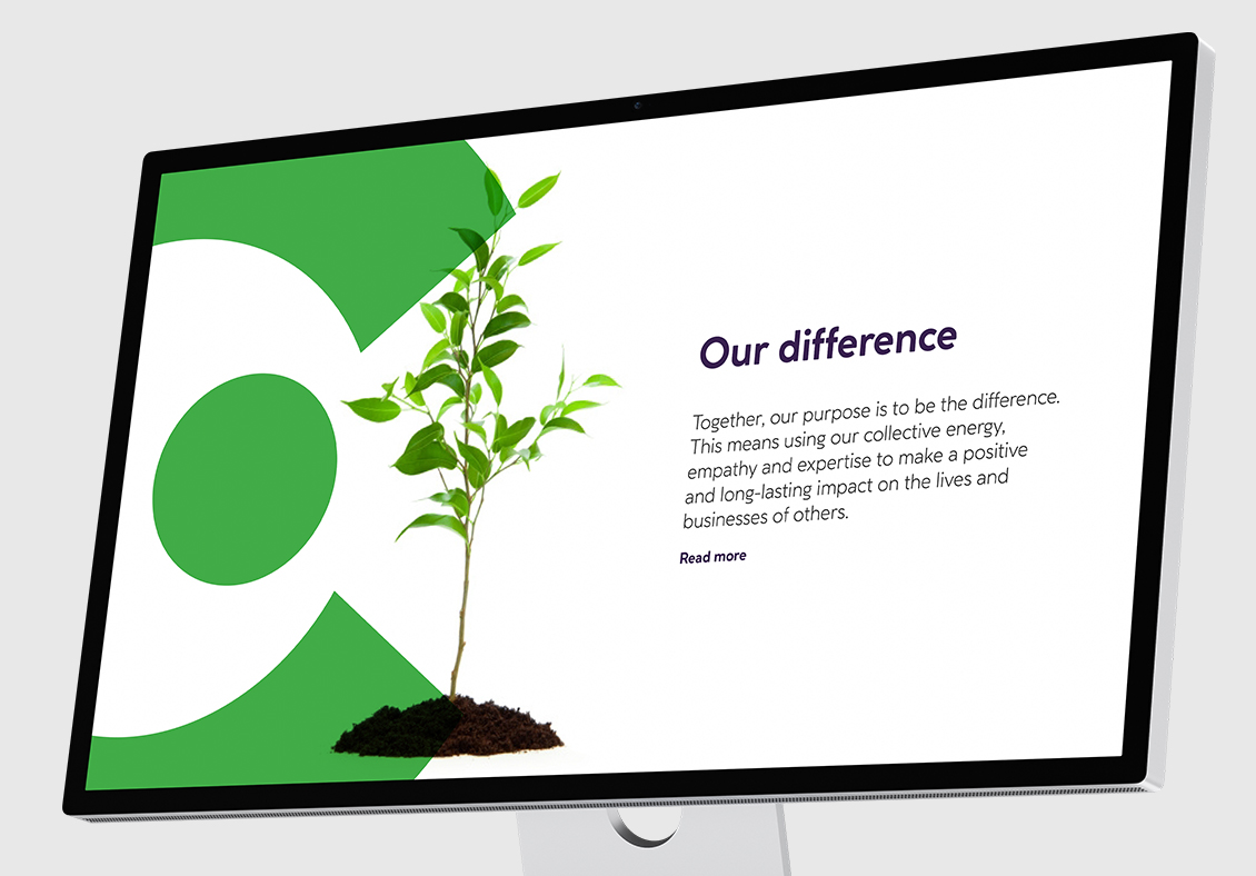
Driven by the messaging work, we created an exciting and vibrant visual identity that included the new logo – especially bold for the legal sector – supported by the use of distinctive graphic portrait crops, a fresh colour palette, new typography, and clear, on-brand art direction for iconography and photography.
Result
Bringing together words and images, we created a brand for Cripps that surfaced the firm’s human side – which stakeholders saw as the willingness and ability to drive difference. The visual and verbal language also drove the design, structure and messaging for the new website and supporting brand launch animation which succeeded in delivering a fresh, dynamic digital experience – one that was equally relevant to Cripps' corporate and personal clients.
Following the launch, our team then created and managed a highly successful Google ad campaign that increased the visibility of Cripps' brand and achieved a click-through rate that was 53% higher than the industry standard (4.47% versus 2.93%). The cost per click was also reduced to 62% below the industry average through the use of highly relevant keywords and daily campaign optimisation.