Bird & Bird
Helping Bird & Bird's website soar with smart UX

Helping Bird & Bird's website soar with smart UX
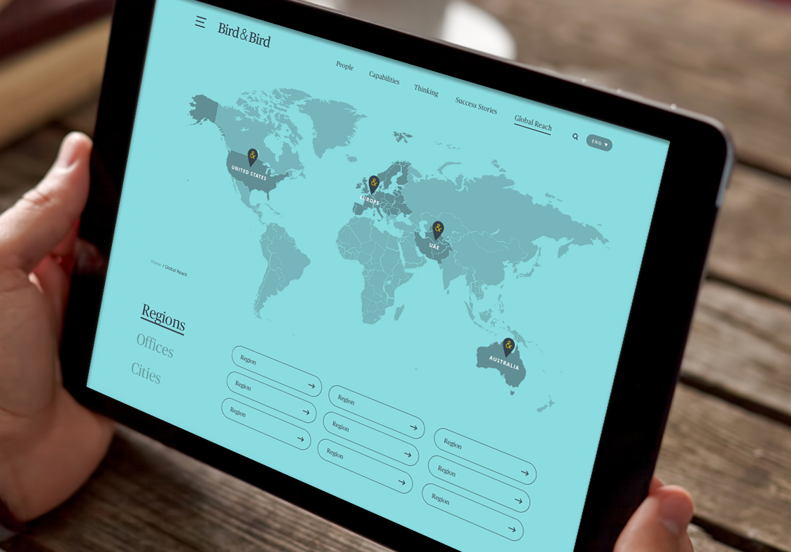
Bird & Bird is an international law firm with a focus on helping organisations being changed by technology and the digital world. With over 1,600 lawyers in 32 offices across Europe, the Middle East and Asia-Pacific, the firm requires a website that can clearly articulate its message in a way that engages a globally diverse and sophisticated audience.
Unfortunately, the structure of the website had been developed unevenly in the past, resulting in a hindered user experience and sub-optimal visitor journeys.
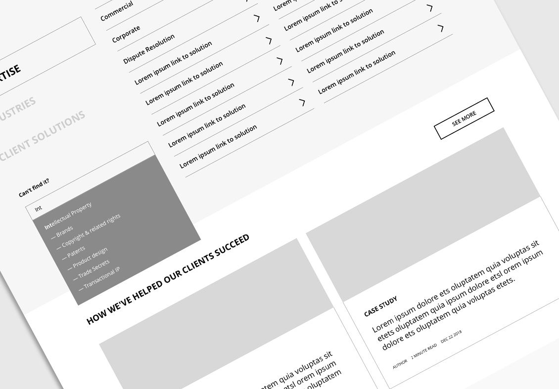
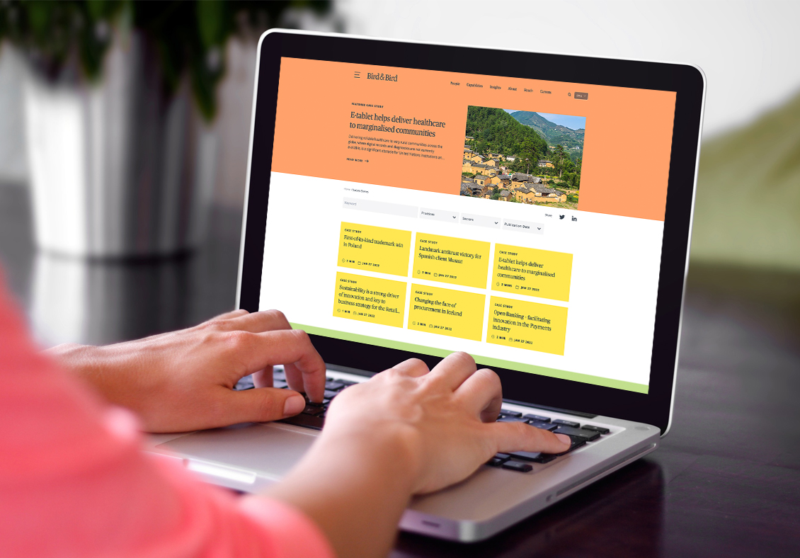
Not all areas of the site were as technically advanced as important sections like 'Client Solutions,' which created an imbalance in how Bird & Bird was able to showcase its practices. Ultimately, the functionality and content failed to sufficiently highlight those specialisms for which Bird & Bird wanted to be best known.
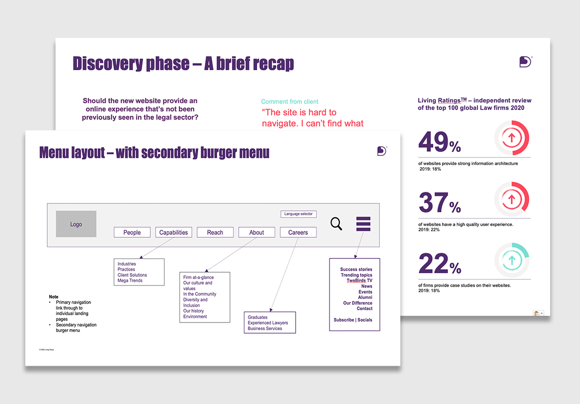
To identify the best path forward for re-imagining the Bird & Bird website, we undertook an in-depth discovery process which involved both qualitative and quantitative components. We conducted a workshop with the senior leadership team to get at the root of the Engagement and Evidence attributes they wanted to see on the website.
We then validated those aspirations with the expectations of actual clients, which we learned through a series of external client interviews. We further explored the needs and ambitions for the website by structuring the questions to be used in an employee fact-finding survey that Bird & Bird conducted.
Distilling our findings from our discovery process, we collaborated with our Bird & Bird marketing partners to develop the vision for the refreshed twobirds.com.
We focused on two over-arching themes based on our proprietary Living Ratings methodology. The first, evidence – the authenticity of the brand-driven content that supports Bird & Bird’s purpose and proposition. The second, engagement – the client-first nature of the website’s functionality and user experience.
Bringing together the insights of our joint findings, we created a clear, compelling and credible presentation of Bird & Bird’s challenge and a recommended response.
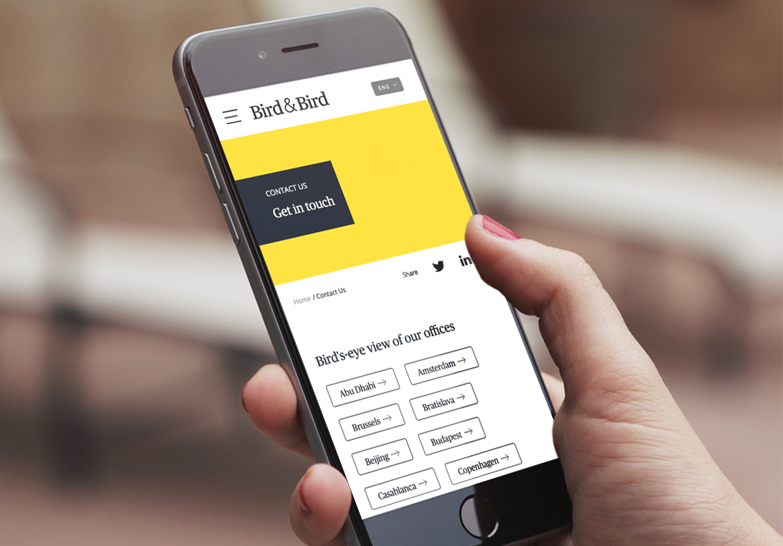
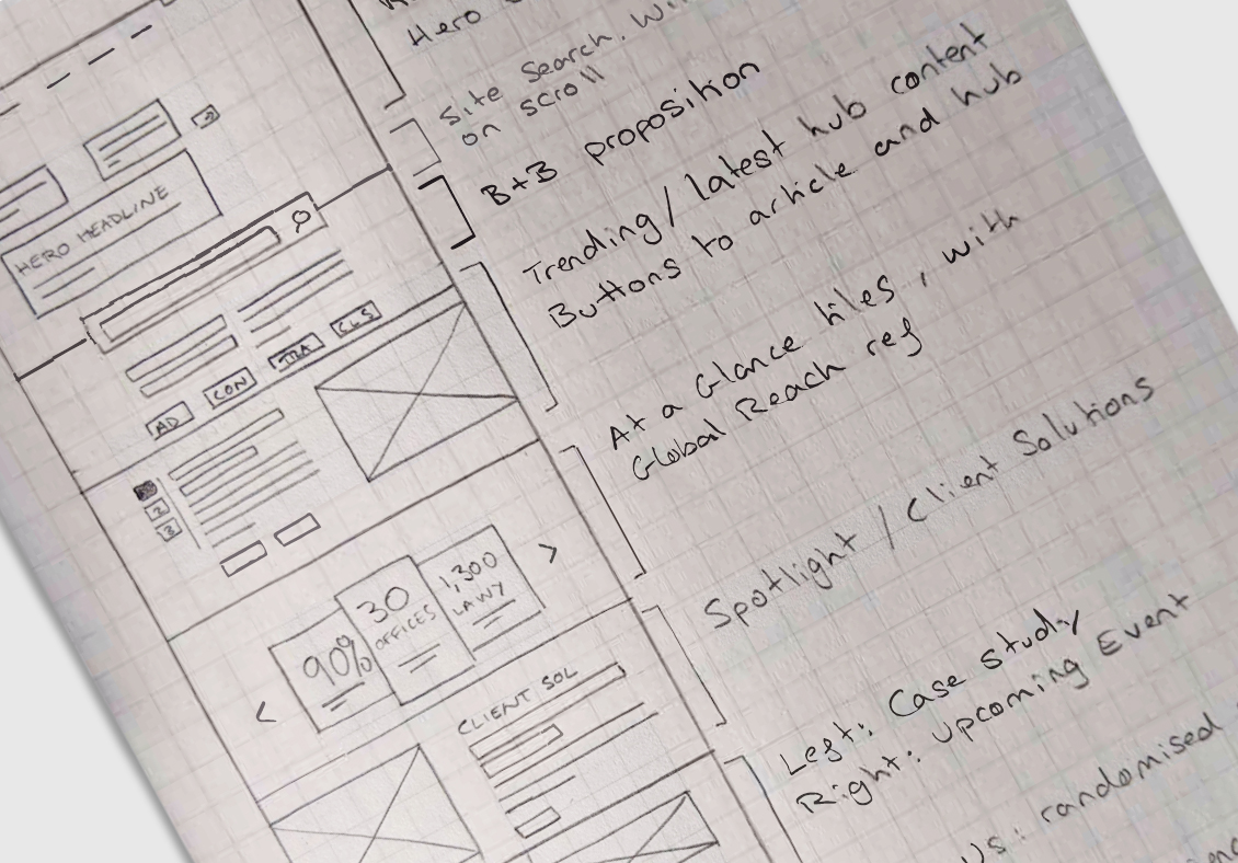
To activate our recommendations, we provided Bird & Bird with consultancy on developing both website content and structure. We took a persona-led approach to UX, working in an agile way with hand-sketched wireframes to iterate options at speed, and provided hi-fi wireframes for the finer detail that fuelled the interface design concepts.
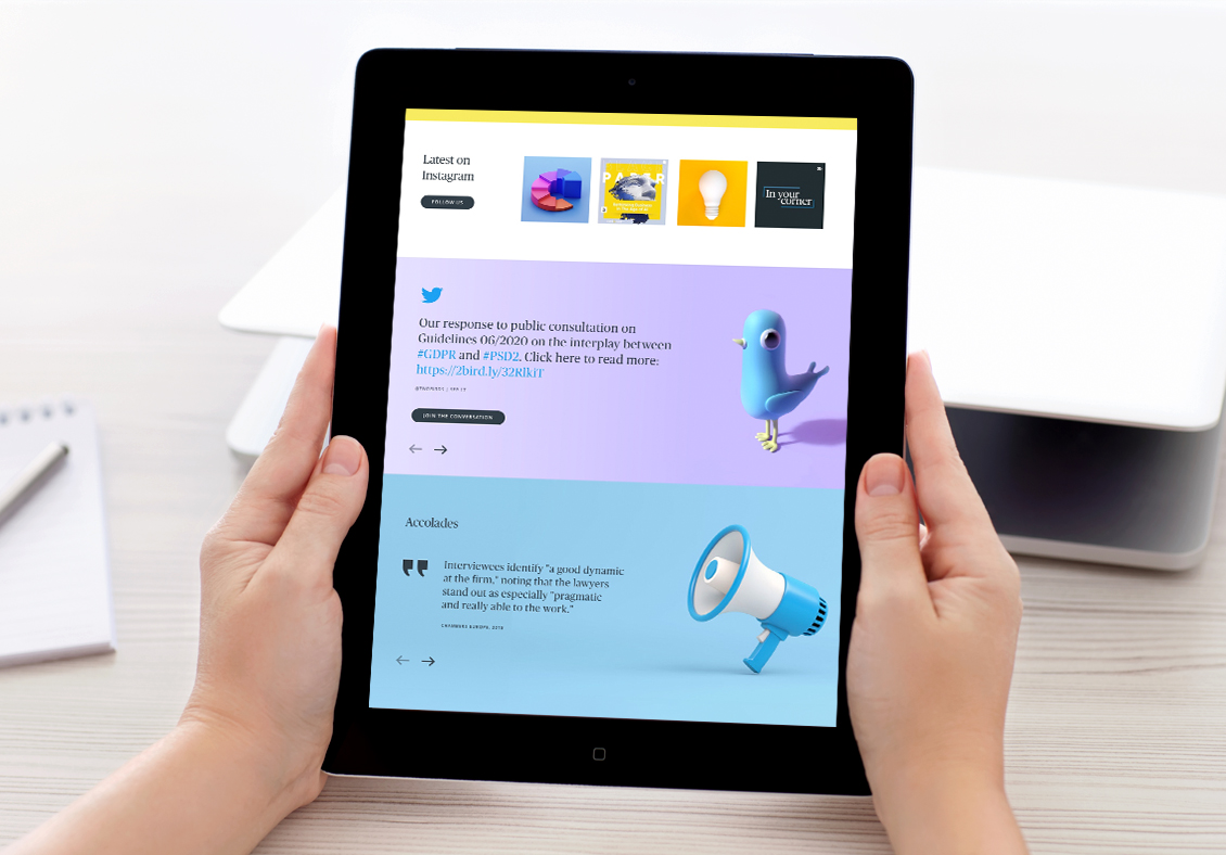
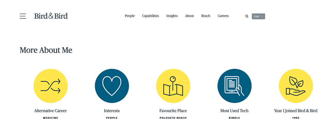
Those concepts focused on how the UX could be brought to life for the website visitor, from the impact of the home page to aggregating the firm’s areas of specialism, through to the careers pages, while also creating a more corporate expression of the ‘About us’ dashboard view.
Bird & Bird had wanted to step out their comfort zone to explore and develop a website experience that would break the mould of the ‘same-old-same-old’. We helped the firm achieve this by providing the path towards a streamlined IA, engaging UX and proof of concepts for the UI. Moreover, we created a flow so the website would guide its visitors as they explored and discovered all that Bird & Bird has to offer – as a law firm and a brand.