Akin
A law firm brand that moves with its clients

A law firm brand that moves with its clients
Akin is a vibrant and full-service international law firm with more than 900 lawyers around the world. Founded in 1945 with the guiding vision that commitment and excellence drive success, the firm focuses on building lasting and mutually beneficial relationships with its clients.
While its visual identity and website had served the firm well for many years, it was no longer reflective of the true personality of a fast-moving, progressive and innovative law firm. So, Akin turned to the Living team to help define a new path for the firm’s brand and an innovative approach for its website – one that would appeal to a global target audience.
Our journey started with an in-depth discovery phase, where our strategy team spoke with a wide range of external and internal stakeholders from across the globe. Our objective was to gauge their candid views on Akin, its strengths and its relative position in the competitive landscape. We also explored what each stakeholder wants to gain from visiting a law firm website. We enhanced our research with an astute competitor analysis using our proprietary Living Ratings™ methodology.
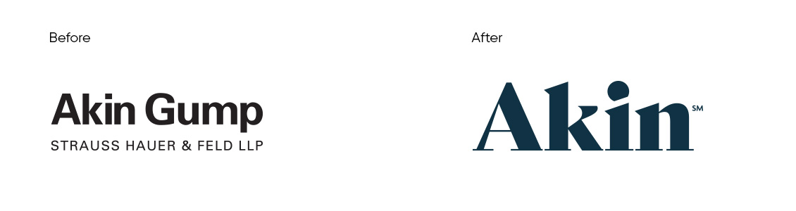
We then distilled our research findings down to four key pillars upon which the new brand and website would be built: Active, Human, Specialist and Excellence. We also recommended that the firm tightened its brand name to simply ‘Akin’ – the name which our research revealed to be used by clients, lawyers, associates and law schools alike.
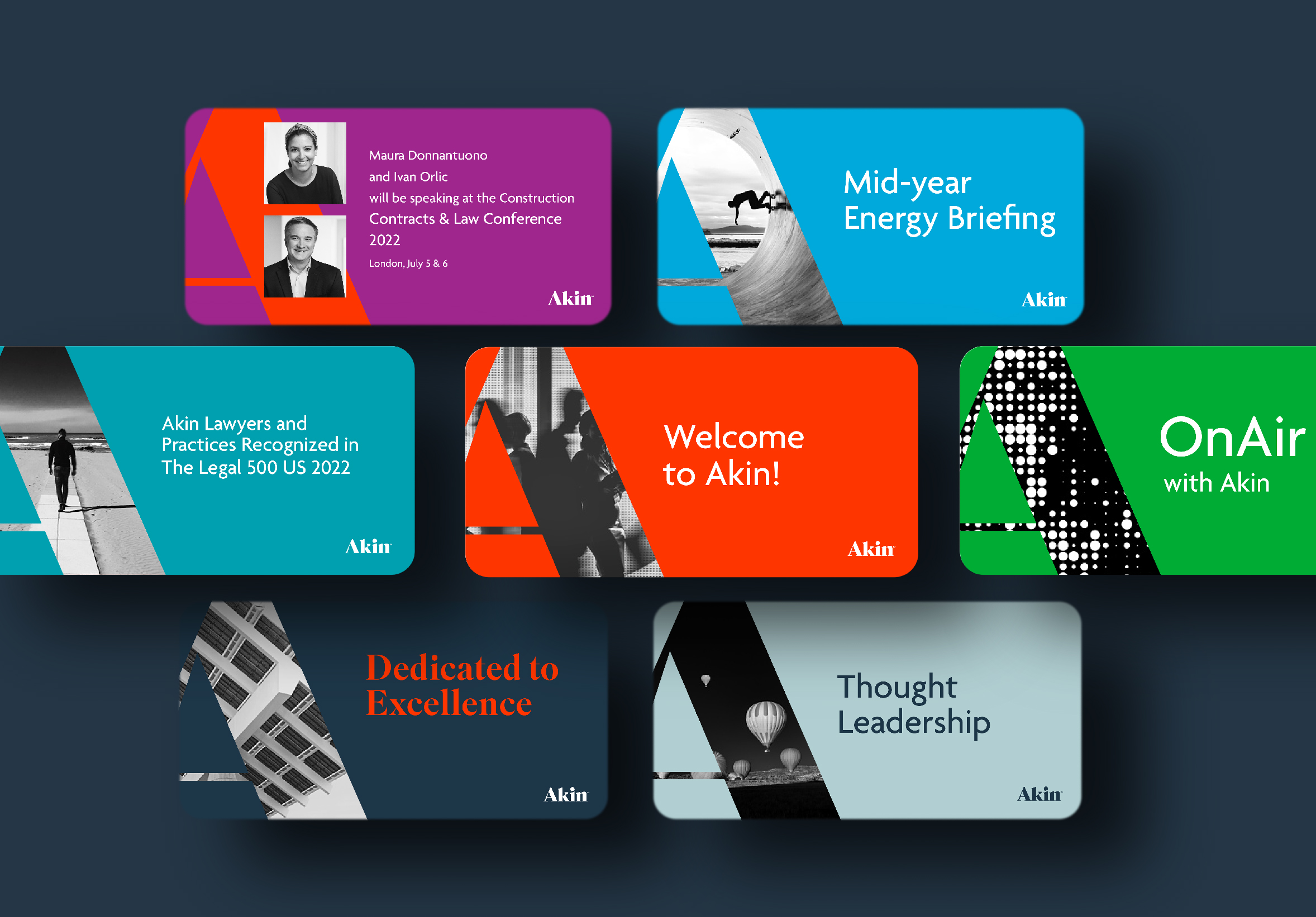
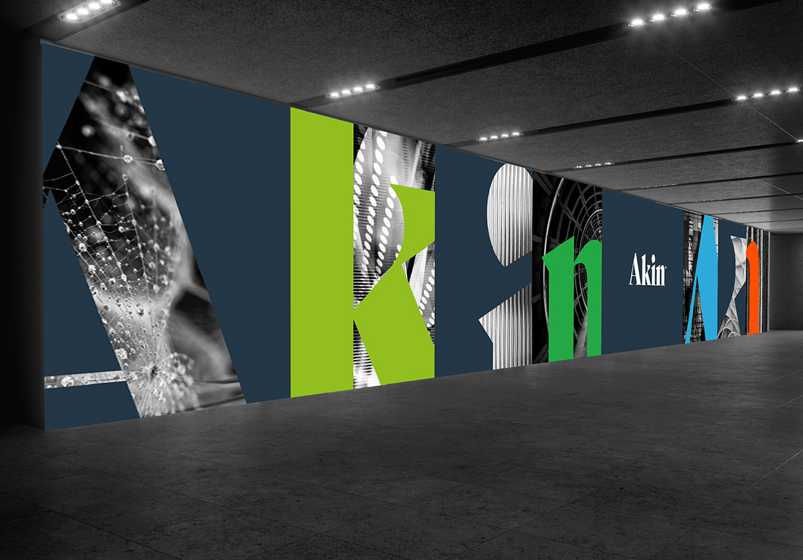
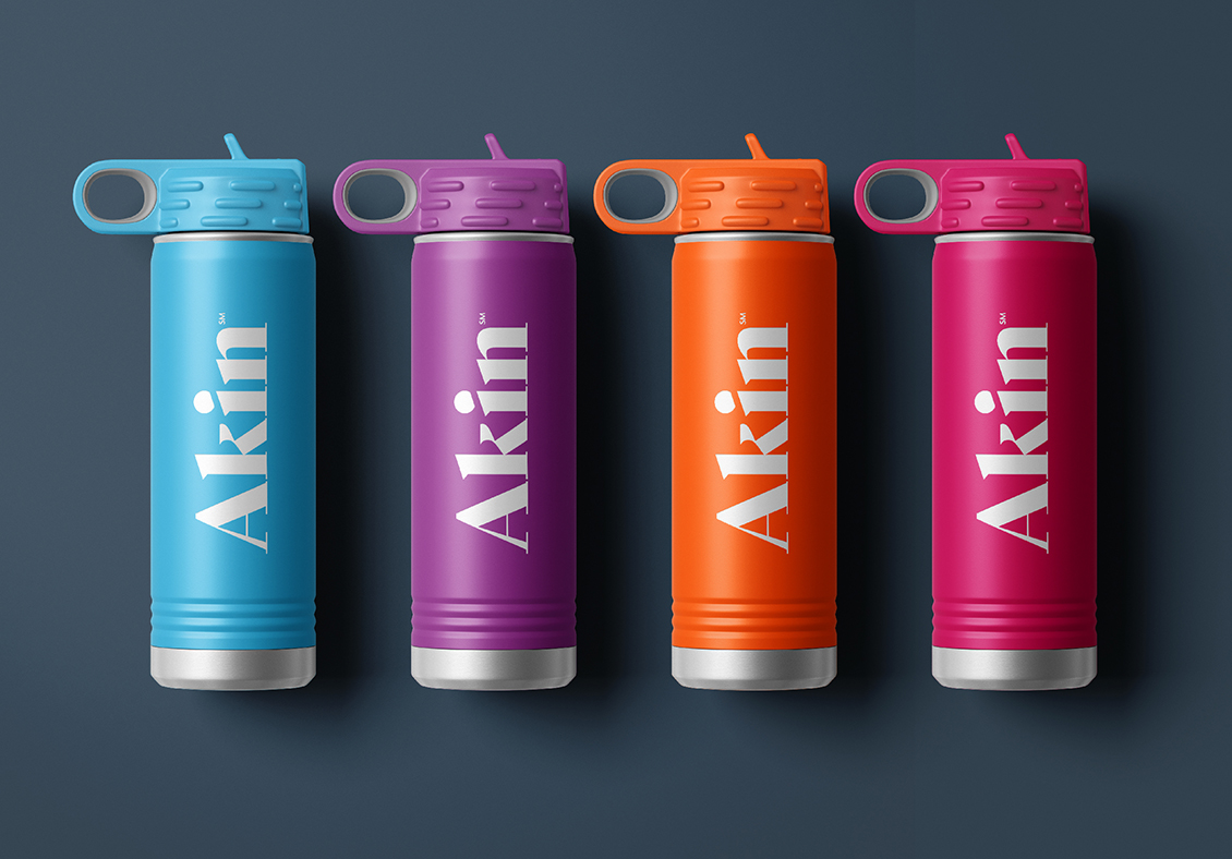
Akin’s new logo emphasises the key pillars, with upward trajectory angles that represent a cutting-edge law firm and distinctive, confident ascenders that portray depth, quality and confidence. It is a fresh marque that’s fit for a digital and fast-paced world. The supporting visual identity is spearheaded by an ‘active’ colour palette, that works in harmony with both conceptual and practical black & white imagery, including new lawyer photography.
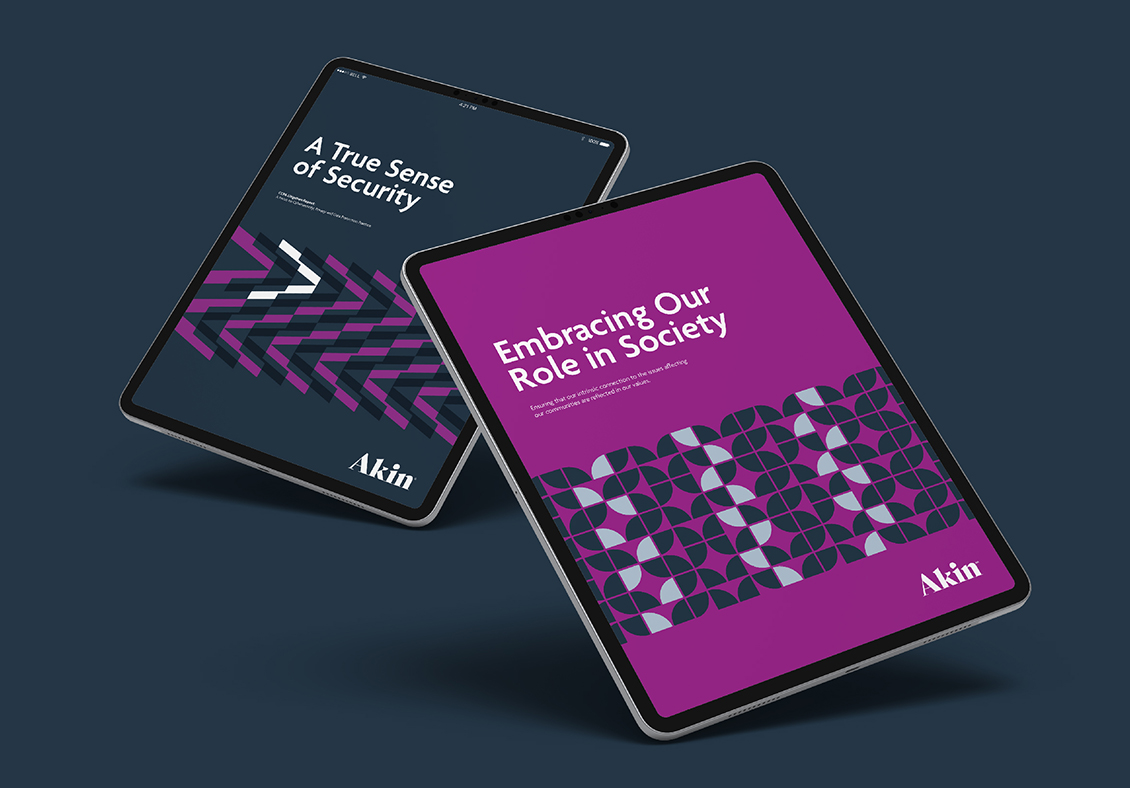
A library of graphic masks, all derived from the logo, was also crafted to house imagery and messaging – creating a unique proprietary brand for the sector, as well as bold patterns when Akin needed to turn up the volume. Sub-brands were then developed for external LawTech solutions, all defined and carefully managed with the help of new brand and tone of voice guidelines created by our team.
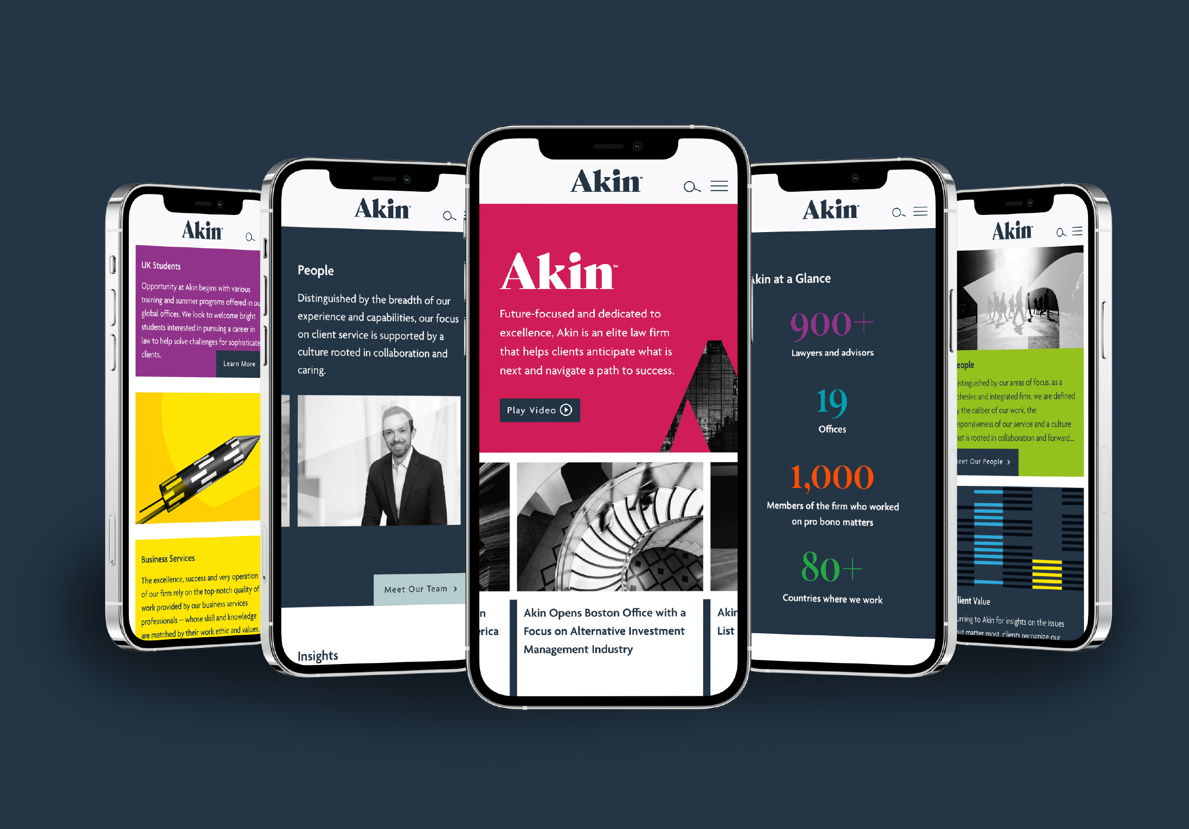
Bringing the Akin brand to life, we totally reengineered every aspect of the firm’s website. Starting with a decisive navigation and thoughtful approach to the user experience and content, we designed and developed an eye-catching user interface that delivers bite-sized content for a time-pressured target audience. We then art directed the website build alongside Akin’s trusted digital partner, creating additional content including animations for the brand and the alumni team.
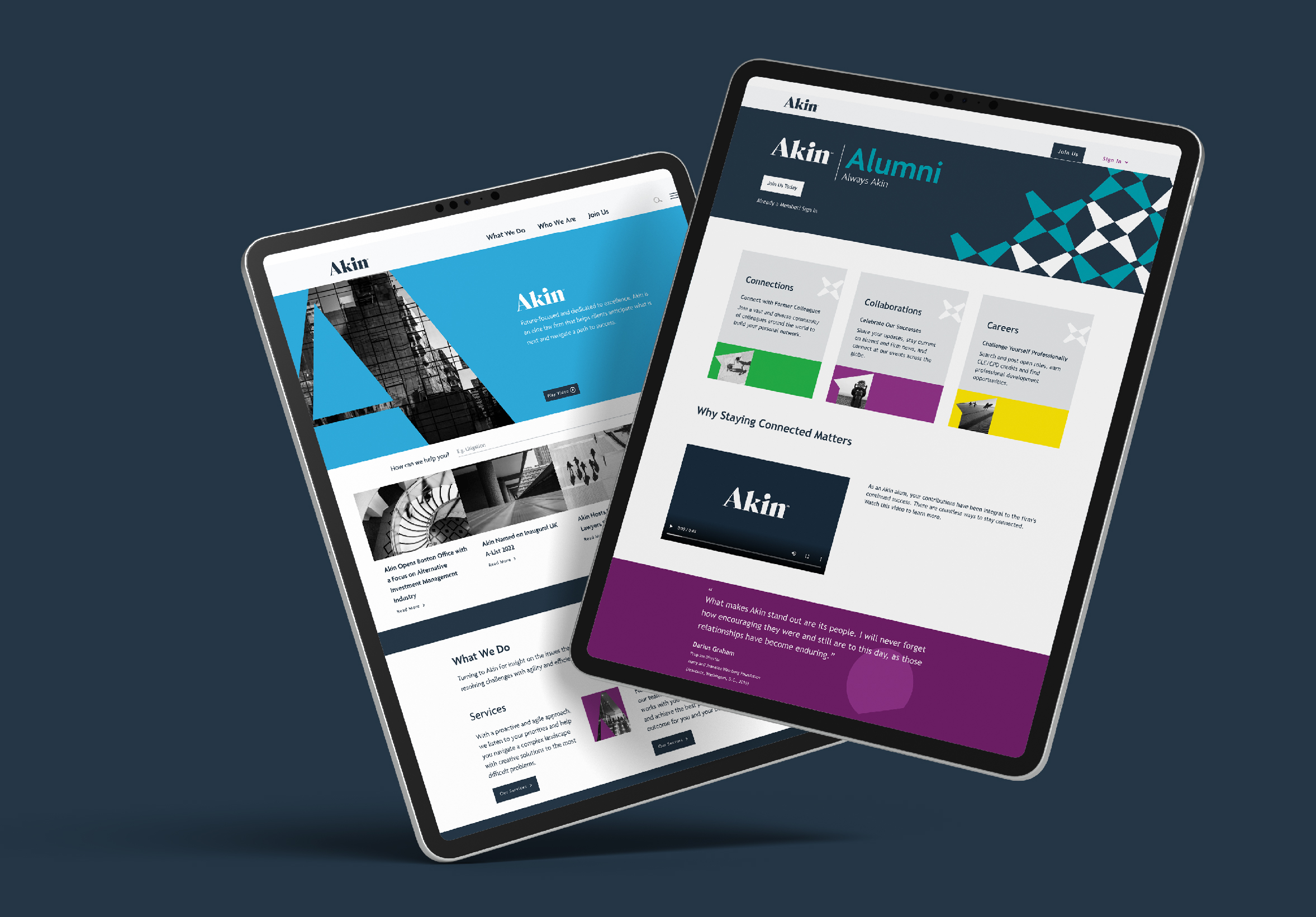
In just over 12 months, Akin has successfully launched its new brand, driven by a new website and a wide range of supporting marketing collateral. The new Akin is a true reflection of who they are today, representative of a diverse law firm ever moving forward to meet its clients’ needs – now and for the future.
Since the launch of the brand in early 2023, the firm has seen double digit revenue increases with the profit per equity partner rising to over 50%.