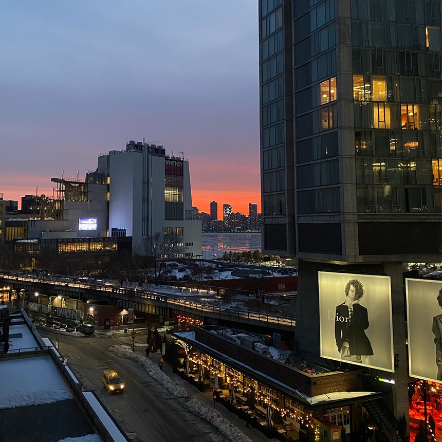
Two months living in New York has sharpened my awareness of sensation. The city is relentless in its physicality: sirens and subway brakes, the smell of coffee carts, winter air against skin, and strangers pressed too tightly together on the subway. It demands to be felt - every commute engages all five senses at once.
02/26/2026
Intern in the city: Designing for the senses
By contrast, much of our digital world feels strangely flat.
Screen time continues to rise in a post-pandemic culture shaped by remote work and endless scrolling. AI-generated imagery floods our feeds, glossy, almost-real faces that bend in ways that feel subtly “off.” Online environments are increasingly frictionless: polished, seamless, optimised for speed. Philosopher Byung-Chul Han described this as an aesthetic of “the smooth”, a world stripped of resistance, texture and depth.
And yet culturally, there are signs that people are craving something more visceral.
This year’s Oscars may be the first in which five nominations come from performances in horror films. Over the past month alone, trailers for gory releases, from Frankenstein to 28 Years Later, have dominated screens. Horror now accounts for 17% of North American ticket purchases, up sharply from just a decade ago. Even outside horror, audiences have praised productions that rely on physical sets rather than digital backdrops, while criticising over-reliance on immersive green-screen technologies.
Perhaps this isn’t simply escapism. Perhaps it’s compensation.
When so much of contemporary life feels flattened and mediated through screens, our senses begin to withdraw. We move from high-street shopping, which engages sight, smell, sound and touch, to digital consumption that is largely visual and linear. Even as marketing gestures toward “authenticity,” much of the online world remains smooth and uniform.
For those of us designing digital experiences, this raises an urgent question: how do we build for depth in a fundamentally intangible medium?
Multi-sensory marketing literature often focuses on consumer goods, the glide of a device, the scent of a store, the texture of packaging. But what happens when the service exists primarily through a laptop screen? How do we design for sensation without clutter? How do we introduce dimension without compromising clarity?
At Living, I’ve begun to see how small decisions can counter digital numbness.
Reactivity is fundamental. Hover states, subtle animations and responsive micro-interactions replicate a basic physical truth: when we touch something, it reacts. A button that shifts under the cursor, content that reveals itself progressively, or a navigation element that moves with intention all reinforce the sense of engagement. They prevent the interface from feeling inert.
Equally important is motion that exists without direct user instigation. Ambient animation, layered transitions and video introduce rhythm into the experience. Movement suggests life. A static page can feel archival; a dynamic one feels present.
Spending a day with our Chief Creative Officer at a film shoot for a brand culture video reinforced this. Watching the production process unfold was a reminder of how dimensional storytelling can be. Focus shifted in and out. Backgrounds softened and blurred. Close-ups captured minute facial details; wide pans grounded scenes in space. Voices overlapped. Light changed subtly across frames. The final edit wasn’t simply visual content, it carried texture, pace and atmosphere.
That layering is something digital design can learn from. Through spatial hierarchy, typographic contrast, focus effects and parallax, a site begins to feel less like a flat document and more like an environment.
Sound, too, plays a role. Branded sonic guidelines and subtle audio cues, even when sparingly used, contribute to presence. A simple swipe interaction can imply tactility. Interactive tools introduce play and agency, inviting users to explore rather than passively consume.
Where elements of contemporary life feel flattened and divorced from sensation, people are searching for depth, weight, and physicality. For something living, breathing, and real. Put short, our senses are in withdrawal. As AI imagery increases digital noise, differentiation will not come from greater polish alone. It will come from intentionality, from designing interfaces that feel responsive, dimensional and alive.
Jacob Whiteley-Guest, Intern, Living New York


Our latest insights, directly to your inbox
